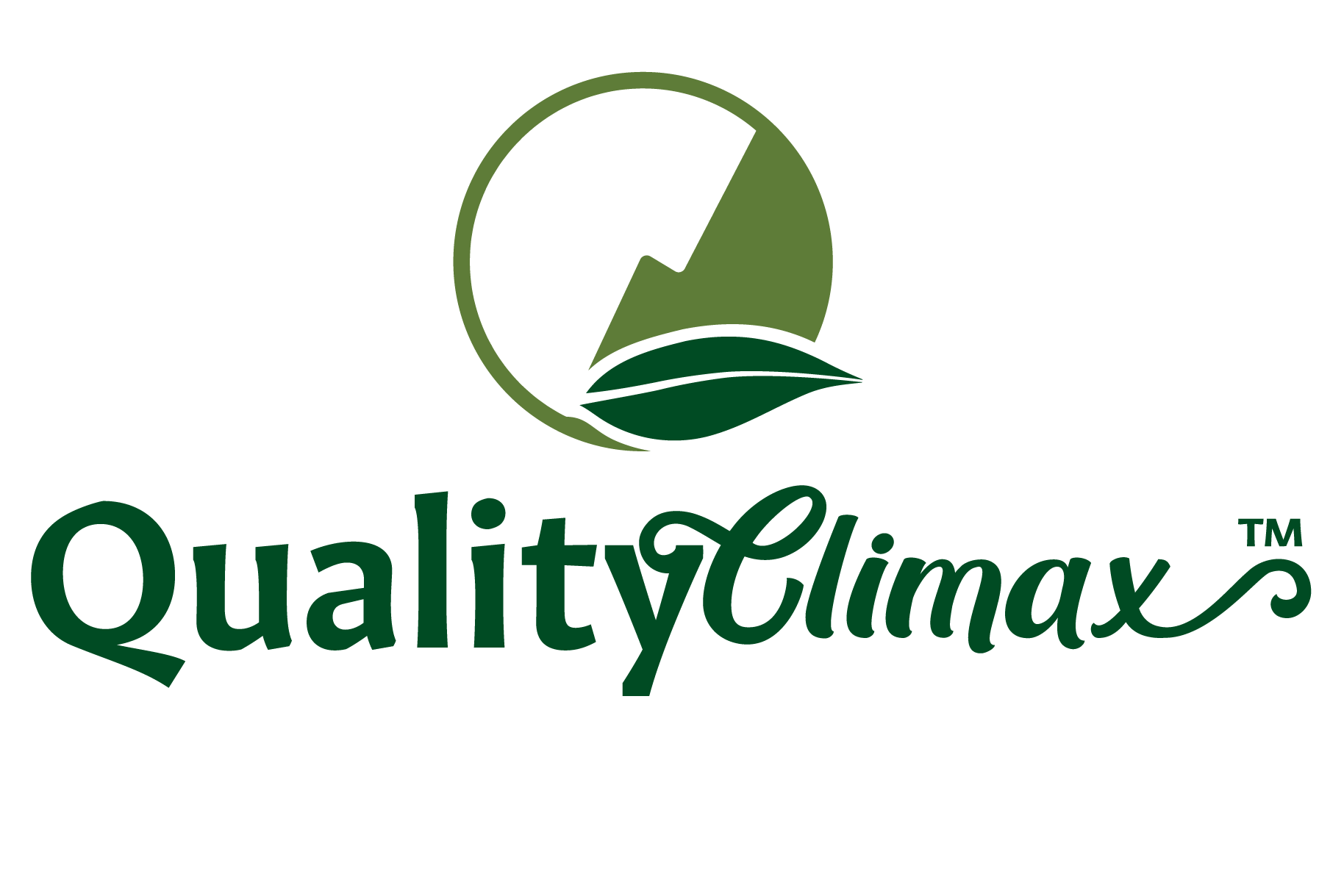
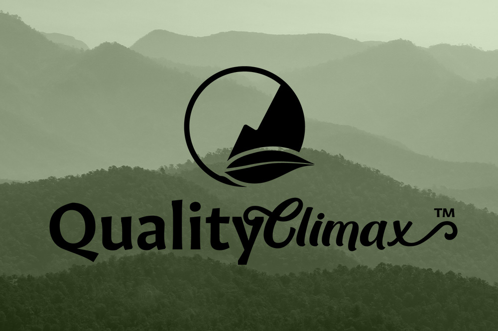
As a high quality supplier of personal care and sanitary items, Quality Climax wanted to exude warmth and nature but with a contemporary feel. The logo we settled on features a logomark of a mountain reaching a climax, with a leaf icon forming a Q. The wordmark is comprised of two different fonts- the first of which denotes sturdiness and quality, and the second part hinting to a more free spirited nature, ending in a 'climatic' swash.
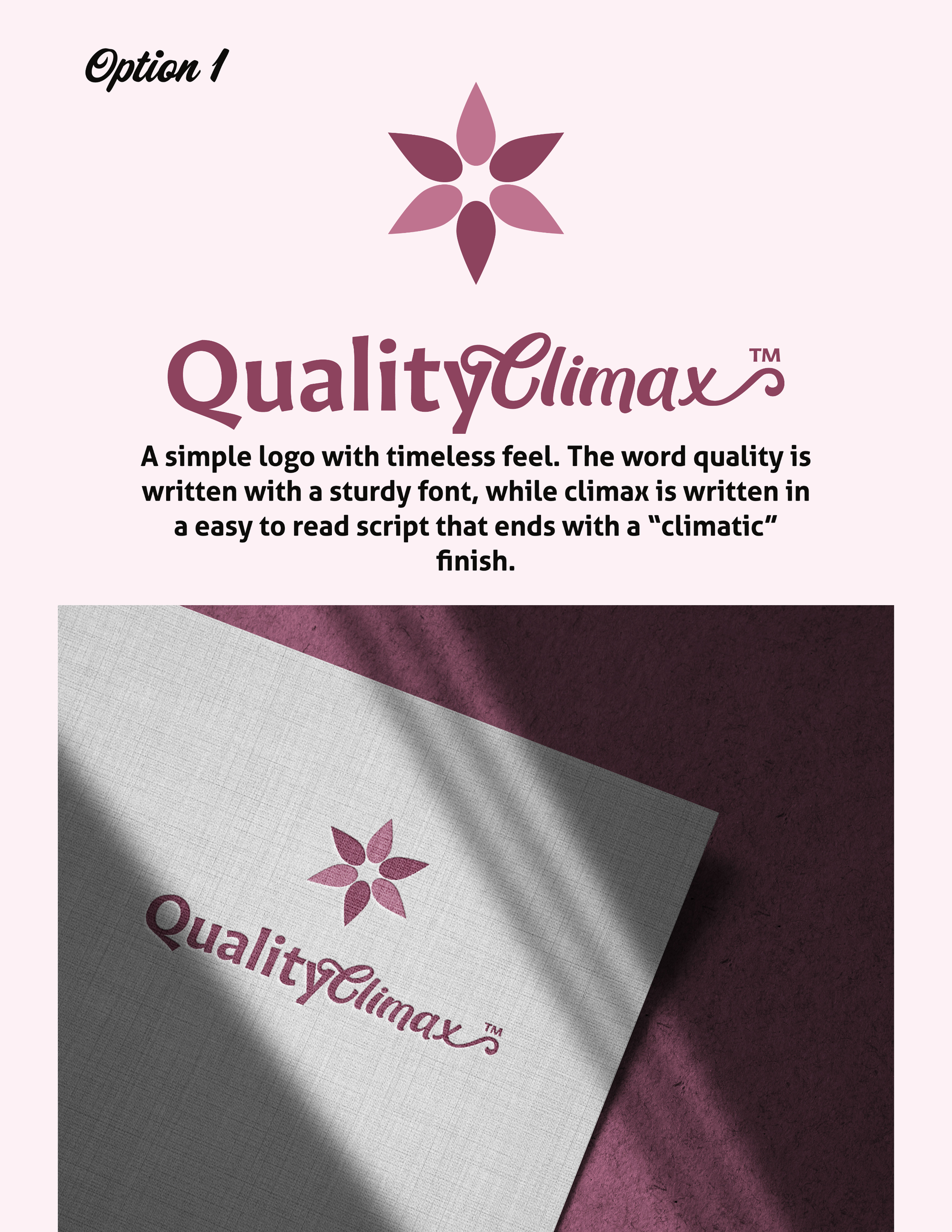
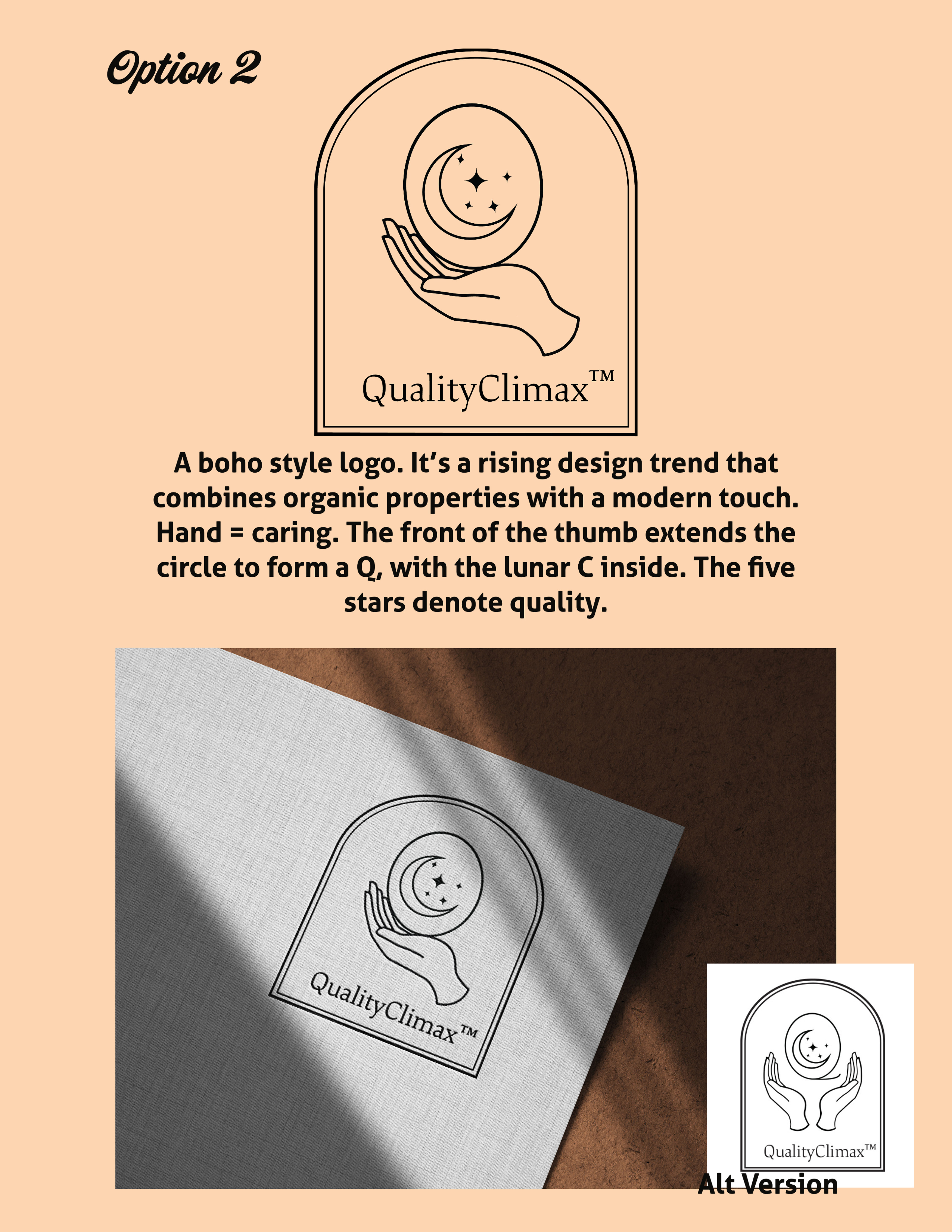
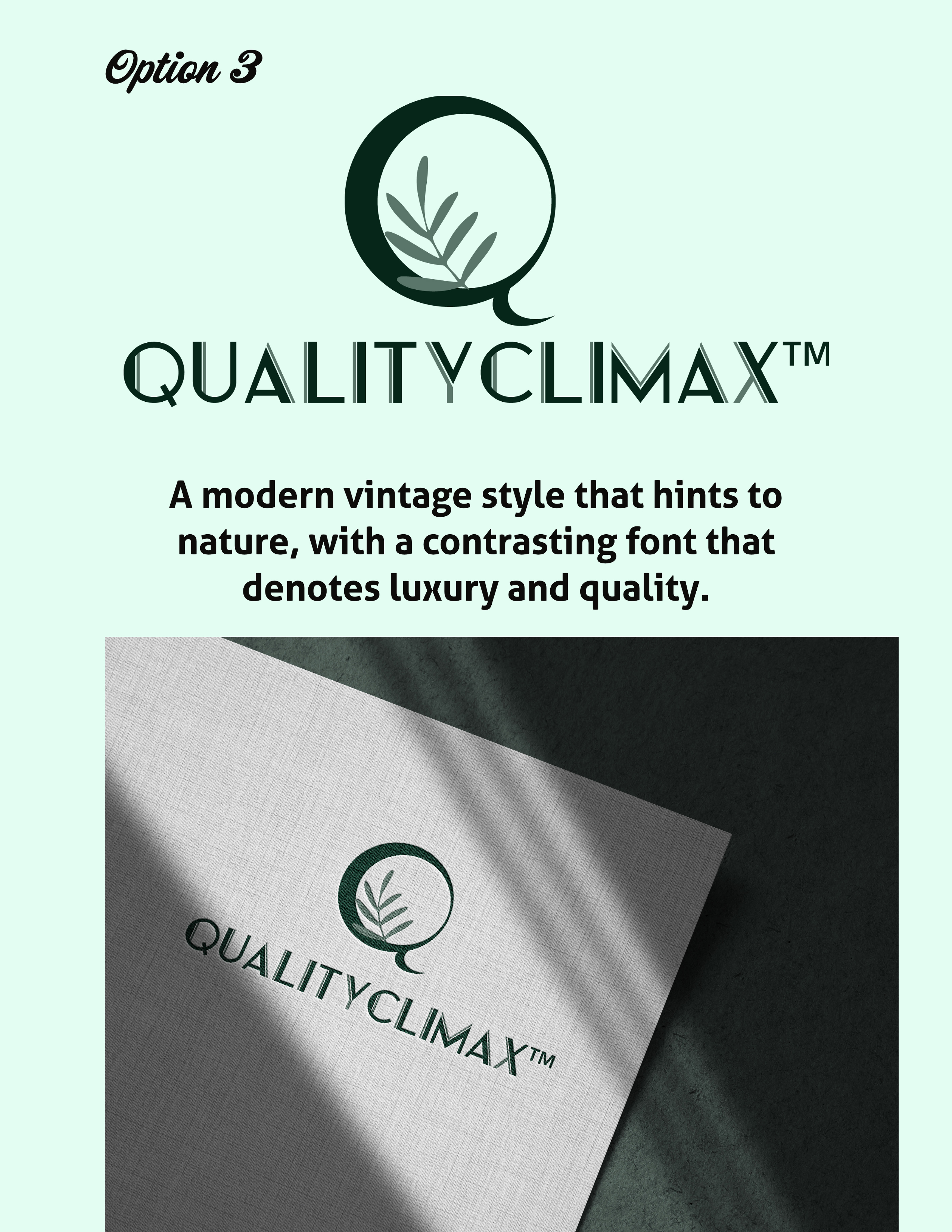
Original Concepts
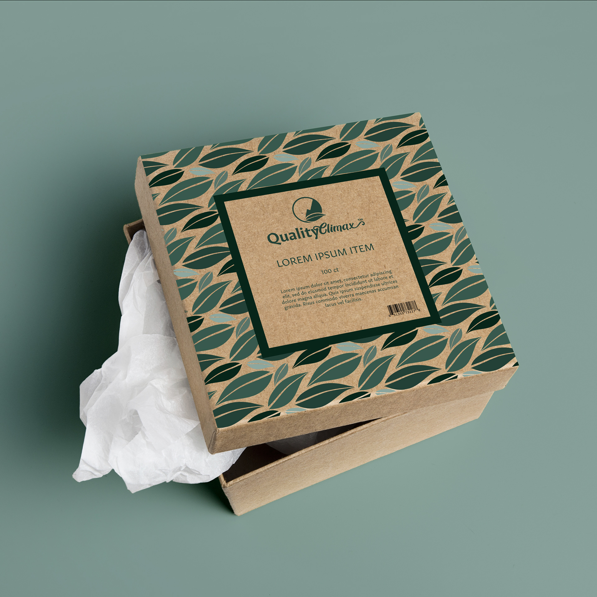
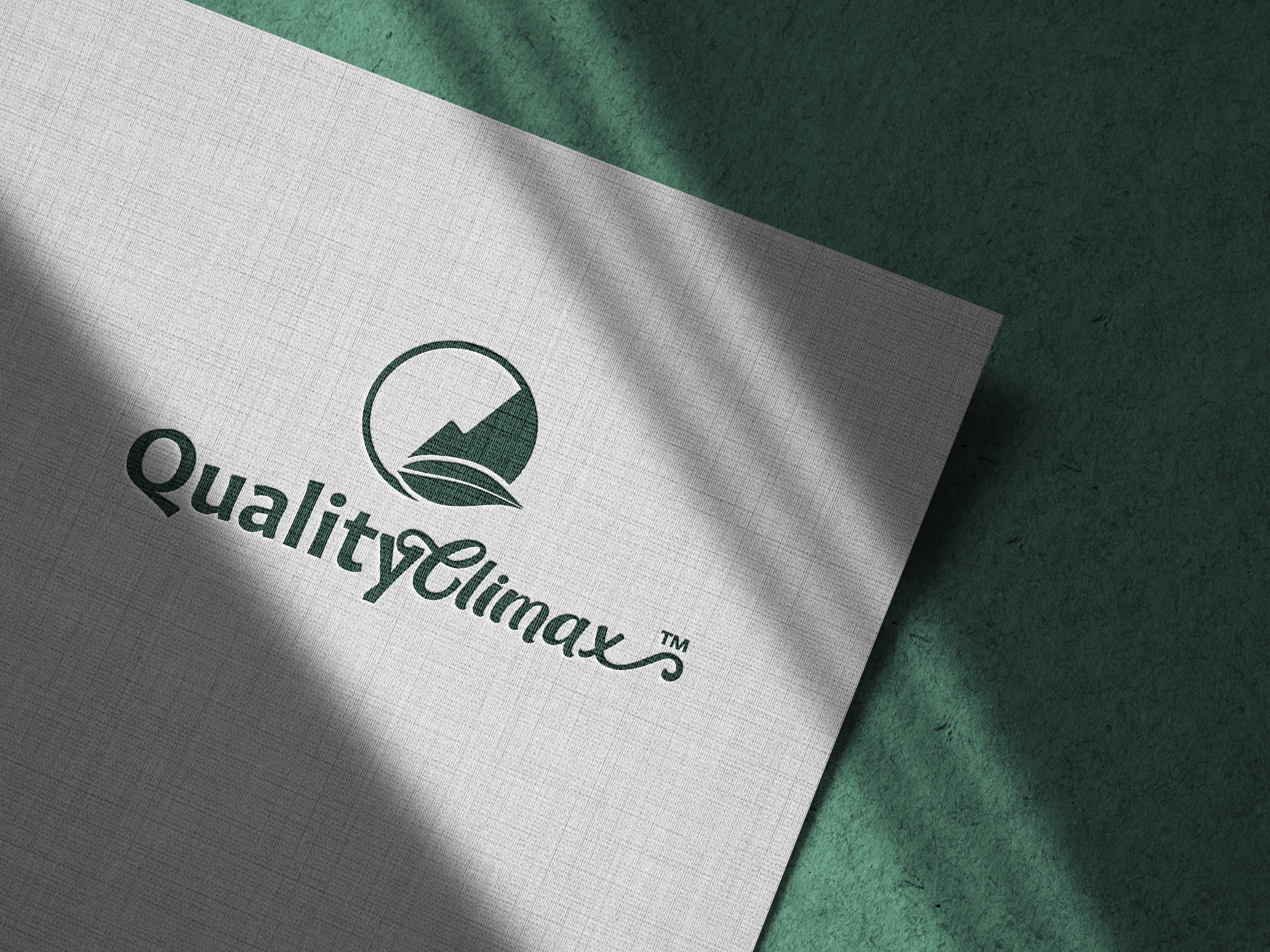
Final Logo Design